No, they haven't stopped working on it.
No, this isn't for BMS. It's for Operation Black Mesa, a remake of Opposing Force. :)
Printable View
No, they haven't stopped working on it.
No, this isn't for BMS. It's for Operation Black Mesa, a remake of Opposing Force. :)
Double posting is for the cool kids only~
I've been busy the past couple days. :)
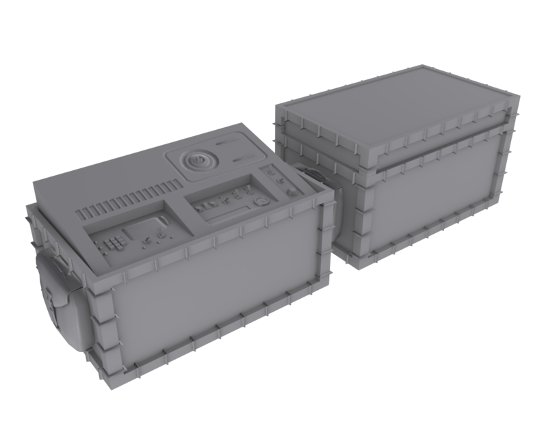
Covered crates:
http://i164.photobucket.com/albums/u...ling/crate.png
original:
http://img225.imageshack.us/img225/6...1a20003xw2.png
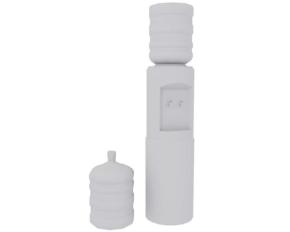
PCV Recharge Unit
original:
http://img217.imageshack.us/img217/5...ot20003bo1.png
http://img205.imageshack.us/img205/4...ot20004ie3.png
water cooler
Also, in case none of you played HL1/Opposing Force, here's the original C4:
http://img195.imageshack.us/img195/396/of1a50003.png
Glad I moved to a new engine. I'm able to do a lot more with my work now. :)
Looks cool. What engine are you talk about though?
boom de yada
http://i148.photobucket.com/albums/s...mdeyadah-1.jpg
http://i148.photobucket.com/albums/s...oomdeyadah.jpg
A train I textured for plague, which he modeled. there is no normal or spec, its the shader. Also I see my seam, so I'm going to fix that.
:D
The seat looks kid of weird how the button gets cut off at the end, usually there would just be no button there.
Quote:
Originally Posted by NuggetWarmer
As a forklift driver :iamafag:, that pallet would never be stacked like that. Id be on its side. Just for your accuracy.
Decided to clean my AR up a bit seeming as it is an old model and poorly modelled. It seems alright now. 3843 Triangles, may lower it as the detail on the right side of the weapon is not seen and can be removed. But it is under 4K which i want.
http://i58.photobucket.com/albums/g2...saultrifle.jpg
http://i58.photobucket.com/albums/g2...e_Unwrap-1.jpg
http://i58.photobucket.com/albums/g2...e_Unwrap_2.jpg
You're going to have seams all over the place with an unwrap like that.
Hmmm, I see your point. I was thinking that whilst unwrapping. Dam it, will sort it out tomorrow, can't be arsed now.
I never really try to make a render with anything more than a diffuse and sometimes specular, so I was just randomly messing around to try and make a decent looking render.
The "dull" metal parts look a bit cloudy and lack any kind of scratches, dirt, grime, or other detail in general.
If you're trying to make a good render... I would suggest trying to make it as life-like as you can. Like rooster just said, adding small details always help. Also, if it were me, I would make the energy sections glow a bit. Also it needs a background and what not.
Doing an SMG texture for WM.
http://img17.imageshack.us/img17/5815/smg1.png
Only part that is done is the suppressor, everything else either hasn't been touched or is still being worked on. He requested that the indents in the grip be red.
This is the third texture I've ever done and it'll be the only one I've finished thus far when I'm done.
Diffuse only. Texture on the clip is a placeholder.
e:
http://img20.imageshack.us/img20/9536/smg2.png
Looks good for a 3rd texture.
I don't understand how he's up there even. His foot is not standing on anything and both of his arms are behind him, not holding on to the crane/box.
Whoever's got some sort of file upload on this page, take it down. It's causing a username/password dialog to pop up:
"A username and password are being requested by http://ts.wmclan.net. The site says: "Wmclan's Files""
This.Quote:
Originally Posted by ExAm
Only person using the WM server is Dee with his sig.
It's one of Mr. Big's render. Saw it before, but not since that thing popped up.Quote:
Originally Posted by Hunter
Its for security reasons. Hopefully E3po will fix it.
Sorry bout that, its fixed.
Nice and simple portfolio.
http://i58.photobucket.com/albums/g2...tfoliocopy.jpg
You're not going to get much cred for making models of models. Design something, and then put that up.
Put 'fan art' after 'Halo 3' bungie can probably like fuck you sideways for not stipulating that you did not work on Halo 3.
@Both of you: I will do both of them things :)
Really my first decent unwrap
needs less grunge, especially on the bars.
k
Why do people always make things look so dirty and worn out?? D:
Looks nice anyway.
Because its harder to make things look realistic when they're new.
Not unless you have absolutely no idea what you're doing.
I have some works on my deviantart page (iTails). Feel free to look at those and crit them.
WIP magnum texturehttp://img259.imageshack.us/img259/7237/skin2v.jpg probably sucks tho cuz this is my first real skin besides a couple of metal textures and a horrable paint skin.
You do the detail like that with a normal map not bevels. Never use bevels.
if your talking about the models tetail, then its the unedited bungie model. I cant use bumps in halo anyways because you need a light source like a flashlight or sompthing to see it.
No he's talking about the texture details. Like around the grip, you used bevel to make the bumps and whatnot. Don't do it. Bevel sucks. It never looks good.Quote:
Originally Posted by n00ber
i dont realy know any other ways to make fake bumps because im a total photoshop noob. but im redoing the grip anyways
I consider myself a photoshop noob too. I've only been doing it for about a year. Also, is it just me or is that texture low res? The spots where you did use bevel look extremely jagged.
texture is 512 by 512, ive been doing photoshop stuff for... maybe a couple of months.
You definetely don't want pre-defined lighting.
Not much left to do:
http://img269.imageshack.us/img269/8170/smgdasgnkl.png
zoom in on the gun, we cant see shit
That texture is a bit too dark, and there isn't enough contrast to see the individual parts. It almost looks like one solid mass.
The Unwrap:
Model(Already posted):
Besides some black space. How does it look. It was really just a box unwrap. I had to edit it a bit but it was fairly easy for the most part.
almost finished http://img262.imageshack.us/img262/9646/magnumskin1.jpg
I like how you keep your smg's in the bathroom.Quote:
Originally Posted by MrBig
that looks very falloutyQuote:
Originally Posted by paladin
It scenery for QPQ.
looks to clean to me :/ oh and btw http://img175.imageshack.us/img175/3...mskinfinal.jpgQuote:
Originally Posted by MrBig
finished :neckbeard:, my first real weapon skin finished, just need to add some small details
http://fc08.deviantart.com/fs44/i/20..._by_iTails.png
Recently finished this, feeling quite proud of it. Feel free to crit.
that pistol looks terrible.
way too plain.
Paladin, I think its too bright and has too much contrast in the image.
Heres how I would have it.
http://img11.imageshack.us/img11/1038/diffw.jpg
I love how your crit means nothing. every time.Quote:
Originally Posted by Heathen
What I THINK heathen meant to say is that it lacks detailing in both the model and the skin. I myself am not a good skinner, I couldn't tell you exactly what needs to be done here, but the grip its self should not be just a simple texture. It needs the detailing in the grip, and some wear and tear to match the rest of the gun couldn't hurt. For a first weapon skin, I'd say it isn't too bad.
Besides the fact that you've been banned more times than I care to count, that looks pretty good.Quote:
Originally Posted by Dotkito92
any way, yea i know, the grip to me always seemed to be a non metalic kinda rubber-ish thing anyway, but ill add some wear to it just for lulzQuote:
just need to add some small details
Just made this on my DS and ran it through photoshop to make a gif:
http://i231.photobucket.com/albums/e...m/Untitle1.gif
Quote:
Originally Posted by ßðÐŻÍ££å
wasnt alot of crit going on in my thread so i thought i'd repost it here.
cupboard it's a cupboard i made.
Made from a kit or custom?
Either way it looks good.
Nice cupboard.
Updated with some text, made it my TF2 spray
http://i231.photobucket.com/albums/e...xAm/ohdear.gif
http://www.modacity.net/forums/showthread.php?t=17252Quote:
Originally Posted by NuggetWarmer
:downs:
sorry i don't read threads that i have no interest inQuote:
Originally Posted by BobtheGreatII
:downs:
Just dropped it off into an art show, saw the other 3d exhibitions...
i got dis.
got what?
You forgot the text.Quote:
Originally Posted by MrBig
And color the metal on the ejector slide lighter metal gray.
You ever tryed texturing weapons?Quote:
Originally Posted by Limited
you know you're only using about HALF of your texture right?Quote:
Originally Posted by Limited
you should try to get some better UV's in there. that being said, you can mirror the sides and what i guess are the front and back as well, saving you even more space, letting you put in alot more pixels on the same surface.
I dunno if this is entirely right (or at all legible), but here's what I would've done assuming I wasn't totally incompetent with 3DS:
http://i298.photobucket.com/albums/m...ssmumv2/uv.jpg
...and there you go. Half the map space used, meaning you could expand what you actually need to fill the whole thing. Better detail on the texture, better map usage, better all round.
ty
Colors?Quote:
Originally Posted by ExAm
You need to define the edges a bit more, but the edges on the silencer a waaay to defined. Looks nice though, different shades of black give it a nice effect.Quote:
Originally Posted by MrBig
The model looks good but I do like the sight on the model. Nor the front grip. Will you have a god at texturing my ODST Silenced Pistol?
The SMG looks pretty nice though.
Made a quarter basically.
Head will be done in Mudbox or Zbrush.
Need to find references for the opposite side.
Will be baked, then textured by MrBig.
Animanatee.Quote:
Originally Posted by t3h m00kz
I didn't change the lighting when I did that view, so the light was still coming from above and caused a shadow on the silencer and such. Model was made by Floyd.Quote:
Originally Posted by Hunter
I've got a bunch of stuff to do right now, it's taken by me like a week and its still not done. Now I've got even more to do with being the head of the graphics department at my school newspaper and having to stay after school every other day or so. Then I've got all this AP shit I have to do. So ya. Don't think I could get your pistol done in any close timeframe.
Started to try and learn to texture..
Here is my attempt at a rat nest styled wall texture:
Diffuse:
http://img188.imageshack.us/img188/9923/diffuse.tif
Normals:
http://img188.imageshack.us/img188/719/normals.tif
Together:
http://img30.imageshack.us/img30/2637/renderprev.jpg
Normals were modeled in 3ds max, then baked
E: just noticed my normals are a little to round compared to the ones in halo 3 :facepalm: oh well
...You had to bake that?Quote:
Originally Posted by Ki11a_FTW
Dear god.
On top of that your "diffuse" is severely lacking. It doesn't look like anything, just some vaguely metal (or is it stone?) noise and scratches on top of some simple colors.
My only complaint is not enough detail on the diffuse (looks very bland from a distance), and I would also fix how it is tiling. Right now, it is very apparent where the texture ends relative to the Z-Axis.
I don't have much experience texturing, so I'm sure somebody else could give you even better advice; but that's my two cents.
because i dont know how to do anything else :fail:Quote:
Originally Posted by teh lag
And if you mean baking as in modeling it then turning that into a normal map then yes, thats what i did.
E: @ metkiller joe : i see what you mean, should be an easy fix up
Your bake isn't going to come out well. Make your text taper out at the bottom, and that should fix it.Quote:
Originally Posted by Advancebo
How do i taper :saddowns:Quote:
Originally Posted by flyinrooster
I knew what I meant :saddowns:Quote:
Originally Posted by ICEE
Fine, legitcrit:
It looks entirely too plain. It looks like a stone texture applied to a model with a brown handle texture. Add some details. Look at other pistols and try to think about whats missing. You don't need to copy others exactly, but look at their finer details and see what yours is seriously lacking.
Use the border tool, select the bottoms, and use the push modifier to push them out a bit.Quote:
Originally Posted by Advancebo
Your base metal is too clean, and your scratches are too ambiguous, as in they look like they were PUT there for a reason.Quote:
Originally Posted by n00ber
oh ok, that should be easy :downs:Quote:
Originally Posted by flyinrooster
Mr.Big, your smg texture is way to chalky, soft and undefined. Find a way to define the materials because what you're doing just doesn't cut it.
The only part that is done is the suppressor, and maybe the stock and the bottom part, nothing else. The middle just has a base texture applied to it for the time being. But yes, I will work on it.Quote:
Originally Posted by SnaFuBAR
e: banner for school newspaper. New school, so I get to design it.
http://avpdragon.deviantart.com/art/...acle-135104203
Uv'ed
Off reference. Scale the base of it up.
Meh. I tried.
Obviously still a WIP, as my texturing is LOLTEMPORARY in spots. Oh, and there's no smoothing.
Mehhhhhhhhh, [shot] tag them instead of hidding them. Don't like to use that scroll bar at the bottom. Ehh textures look fine I guess. Not much of a skinner but it looks ok.
It doesn't look so much like a destroyed city as a mesh of a city that someone tried to mess up in hopes that it would look "destroyed". The second picture in particular... Idk what could make a solid metal (concrete?) sign bend like that but it looks horribly wrong. It could just be the UVing, but the sidewalks (I think that's what they are?) too look really sloppy. The building in picture 1 looks okay, but otherwise you've got a lot of work to do.
That wall looks more like tinfoil with a rock texture on it than a destroyed wall. There's no form to the destruction, no reason for the different stuff being broken... and how does a broken part of a wall stick OUT that far without being a part of a rock that fell off or something? It looks almost as if the entire wall melted a bit tbh.
Look at pictures of destruction, use those as reference for what you want yours to look like.
Concrete or stone walls collapse or crumble, they don't deform like that. Hell, I doubt even a metal wall would unless some very specific conditions were met.
Maybe these will help you get in the mood:
http://con.modacity.net/ref/
I'd look at more actual photographs though because most of this is concept art.
I pointed this out ages agoQuote:
Originally Posted by rossmum
no changes have been made aside from literal error fixing
it looks like the covenant attacked it with some sort of concentrated beam of surrealism
nothing like explosion or structural damage
Model wise it looks decent, but the textures don't fit it at all compared to h3 odst imo, they used the standard tannish mombasa textures with a dark environmentQuote:
Originally Posted by English Mobster
they were LOLTEMPORARY.
Yeah, the idea was that it was attacked by a Scarab's beam.
I'm going to get to work on fixing it.
http://img268.imageshack.us/img268/4...erekjhgdfs.png
Was bored. Made it in about 15 minutes.
needs more scratches.