Very nice looking animation ICEE, I like the style and flow of it from when he knocks the...ammo box(?) out of it to when he makes a little jump with the gun over to the position where he lifts the top. The insertion of the ammo box could use a bit more movement with the gun, and at one point, it looks like it just goes over the same motion twice (during the time in which he's putting the bullet chain into position). I have an idea for what you can do with the bullet chain insertion also so it doesn't look like the hand just sits still (even though I see movement), but for now I must be off to school.
September 11th, 2009, 12:16 PM
=sw=warlord
Re: The Studio Quick-Crit Thread
Little update on the monitor.
I've started unwrapping my monitor and started with the eye peice.
If anyone can give some crit on this on how to pack the uv's and how to improve generaly that would be greatly appreciated.
I've used the render to texture feature after reading about it in a book i purchased sometime back.
Also been working on materials as well to try and make the texture seem better.
Sorry snaf about using the same sphere model but after tweaking with the one you suggested it turned out worse than i started off with so i went back to the first.
Theres about 160 polies in the entire eye peice including the mount.
Very nice looking animation ICEE, I like the style and flow of it from when he knocks the...ammo box(?) out of it to when he makes a little jump with the gun over to the position where he lifts the top. The insertion of the ammo box could use a bit more movement with the gun, and at one point, it looks like it just goes over the same motion twice (during the time in which he's putting the bullet chain into position). I have an idea for what you can do with the bullet chain insertion also so it doesn't look like the hand just sits still (even though I see movement), but for now I must be off to school.
ok cool man. Ill be on xfire later, hit me up then. I was actually planning on redoing basically all the node gun frames after the mag insert
The red text is very odd looking but besides that i love it.
September 12th, 2009, 12:13 PM
NuggetWarmer
Re: The Studio Quick-Crit Thread
It would look better if the text by the fist was the same as the title color.
September 12th, 2009, 12:15 PM
Saggy
Re: The Studio Quick-Crit Thread
@Snowy: Only complaint I have with it is the "O's" that look like hourglasses. They're too "repetitive" IMO. Maybe you could switch it up a little bit, with maybe a different font? OR use the same font, just use a different but fitting font for the "O's".
Also, is it just me or do those five stars look of center?
September 12th, 2009, 12:49 PM
Heathen
Re: The Studio Quick-Crit Thread
Quote:
Originally Posted by Saggy
@Snowy: Only complaint I have with it is the "O's" that look like hourglasses. They're too "repetitive" IMO. Maybe you could switch it up a little bit, with maybe a different font? OR use the same font, just use a different but fitting font for the "O's".
Also, is it just me or do those five stars look of center?
The font is fine the way it is imo. And it is just you.
My only gripe, make the fist a different red than the star. Slightly different.
September 13th, 2009, 02:41 PM
Corndogman
Re: The Studio Quick-Crit Thread
Make the T in "Party" the same as the one in "The." Also make the G in the second "dodgeball" uppercase, the same as it is in the first dodgeball.
The stars do look off-center since you say that, but I feel like its just my eyes playing tricks on me.
Which looks better for news print?
Maybe suggest other fonts?
September 13th, 2009, 03:45 PM
klange
Re: The Studio Quick-Crit Thread
Would be easier to see if they weren't rendered with the worst hinting method ever.
September 15th, 2009, 06:47 PM
Horns
Re: The Studio Quick-Crit Thread
Second one.
September 15th, 2009, 08:32 PM
Hunter
Re: The Studio Quick-Crit Thread
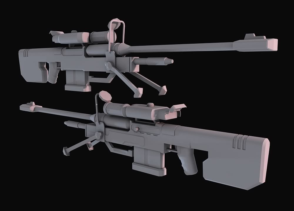
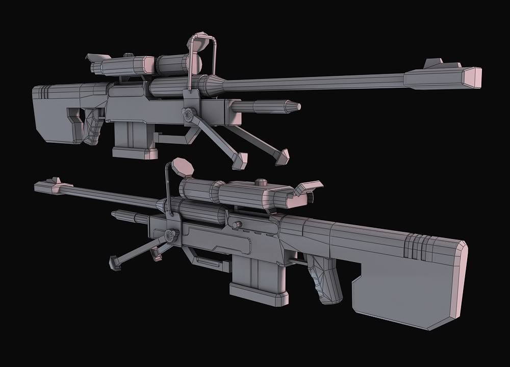
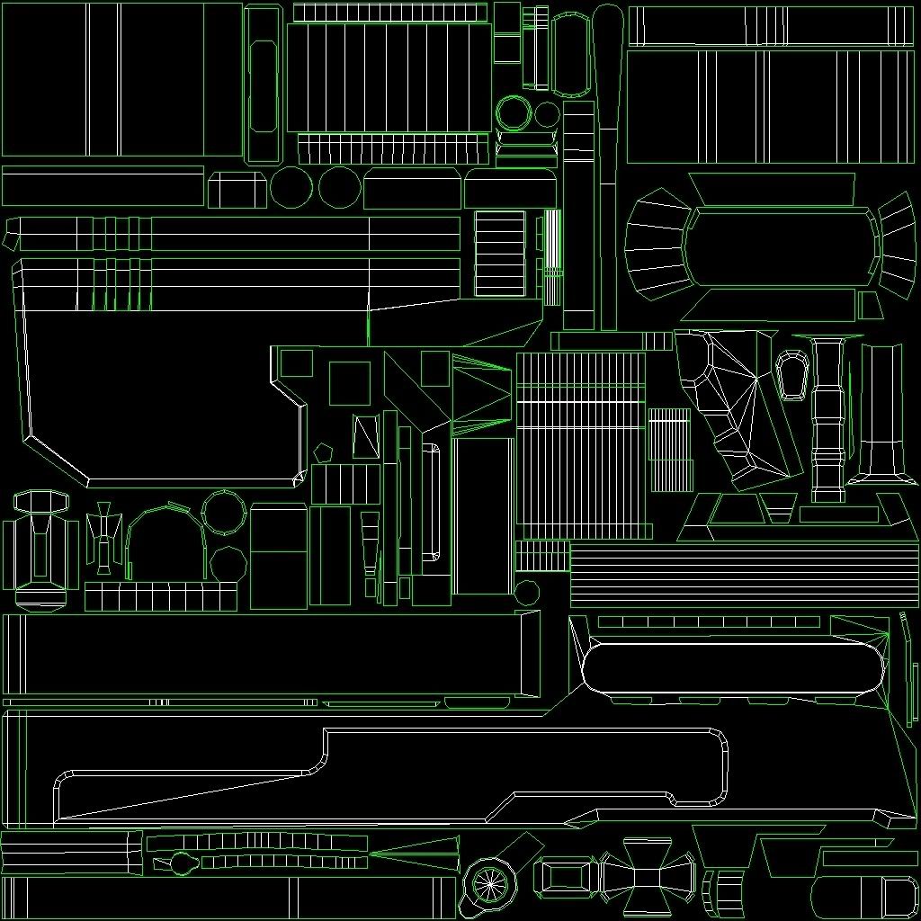
PMSL. Fail unwrap, fail model tbqh.
Triangles: 3648
Unwrap:
(Unwrap was made agoes ago, thats why it looks like a pile of camel shit... I can't see the resembalence, but I need something harsh looking to explain how bad it is).
I think it LOOKS okay though, but it isnt really modelled good. It was converted from my highpoly one which I made afew years back... I may remodel it, and I want to give it a different stock and give it laser sight as well. Need to design my own laser sight thingy though, don't really want to copy teh lag...
And I apologise if anyone seems to think I edited my sniper rifle so I could "dump" it in a thread. No sarcasim intended, I just found out afew people seem to have some sort of personal opinion.
September 15th, 2009, 08:43 PM
Disaster
Re: The Studio Quick-Crit Thread
Your unwrap is wacked. You have large ammounts of space taken up by things that aren't going to be seen such as the stock and grip.
September 15th, 2009, 08:47 PM
Hunter
Re: The Studio Quick-Crit Thread
Like I said, will probably remodel it Lol. :)
September 15th, 2009, 08:48 PM
DEElekgolo
Re: The Studio Quick-Crit Thread
That unwrap looks very familiar...
e:nvm, just me.
Which looks better for news print?
Maybe suggest other fonts?
the heading and subheading for the first one with the text for the second.
September 16th, 2009, 07:50 AM
=sw=warlord
Re: The Studio Quick-Crit Thread
Been working on my monitor model and i would like some crit and advice on how to improve something im working on for it.
For the inner part of the shell there is a pattern where the antigrav light is, almost triangle shaped but after having looked up the diffuse map i've decided to make my own pattern.
Im modeling the pattern out on a plane then i plan on making it a normal map and diffuse for being used on my monitors main bitmap.
any advice or crit on the design would be greatly appreciated.
This is the first time i've actualy gone into this much detail on making a model so...
halp:smith:
September 16th, 2009, 10:50 AM
ExAm
Re: The Studio Quick-Crit Thread
It's a simple pattern. There's not much to say.
September 16th, 2009, 12:14 PM
SnaFuBAR
Re: The Studio Quick-Crit Thread
it's not tiling.
September 16th, 2009, 04:54 PM
killer9856
Re: The Studio Quick-Crit Thread
more detailed object=happy detailed object
September 17th, 2009, 03:31 AM
=sw=warlord
Re: The Studio Quick-Crit Thread
Quote:
Originally Posted by SnaFuBAR
it's not tiling.
Besides the tiling issue which il crop to make it tile is there any other advice you could give?
Im not intending it to make too overly detailed as it wont bit in the space alloted on the bitmap but i would like to know what else to add and if possible how to make the inner parts look like glowing blue glass off some sort.
September 17th, 2009, 04:36 AM
Cagerrin
Re: The Studio Quick-Crit Thread
Upper part started out as something else, lower part started out as H3-ish "shield tower"(and still mostly is).
Oh, and I raped Higuy's Immolate model.
September 17th, 2009, 09:47 AM
Con
Re: The Studio Quick-Crit Thread
Very nice, map seems kinda small though.
September 17th, 2009, 10:09 AM
Rob Oplawar
Re: The Studio Quick-Crit Thread
That's one of the more unique pieces of forerunner geometry I've seen from anybody on this site. It looks good. Kudos.
e: Despite the fact that it's based heavily on the H3 shield tower. :p
yeah you're right, you're not very good at this at all.
September 18th, 2009, 11:30 AM
SMASH
Re: The Studio Quick-Crit Thread
The poly distribution is horrible trulife. I think you really need to start from square one again and reteach yourself simple modelling. Check out the 3DS MAX tutorials at 3DBuzz if they're still free...
Hmm... I'm not really one to say much about website design, but it seems kinda... Plain. I don't know exactly what's missing, but it needs some detail in the background somehow. Sorry I couldn't be of more help.
I'm working on a cover of "Iron Man" by Black Sabbath. I want to know which version of it you guys like better.
I've been playing the guitar for about a year or so now, although I'm entirely self-taught (never took a guitar lesson in my life, though I CAN read music).
Also, yes, I know I screwed up here and there, so sue me. I don't have any fancy audio editing software and this was recorded in real-time using a headset mike. I think it sounds kinda good, though, aside from where I hear myself fucking up and playing a fret too high or only strumming one of the two strings I'm supposed to strum.
It MAY still be processing.
September 18th, 2009, 07:54 PM
mech
Re: The Studio Quick-Crit Thread
That sounded terrible. Partly because you have a bad amp and I'm guessing you have a cheap guitar, although, a bad amp can make a good guitar sound like shit.
So after realizing that it'd be a pain in the arse to convert the Forerunner erection Immolate had to be more like the Halo 3 version, I figured I'd go a different direction with the wall on that side.
September 18th, 2009, 11:56 PM
killer9856
Re: The Studio Quick-Crit Thread
O hai thar, thatz mah map u got thar
Looks good! I like your forerunner, looks muy bien. Also, are you remaking parts of immolate? Because I'd like to know :3
September 19th, 2009, 12:06 AM
Cagerrin
Re: The Studio Quick-Crit Thread
Just the Forerunner parts. So far I've got this wall and a rough version of the other wall/room.
You're absolutely welcome to the models, but they're probably not much use since I model in Sketchup.
Noticed that while it was rendering, did a few tests. Due to the overhang of the lower wall, pretty much any detail up there is useless.
I mean I could still do it, it's not like I have to worry about polycount or anything...
September 19th, 2009, 12:48 PM
Disaster
Re: The Studio Quick-Crit Thread
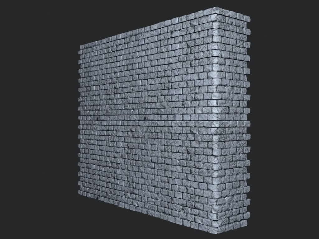
Modular brick wall assets I made today in zbrush. THe low res mesh is sitting at 6k triangle per piece.
September 19th, 2009, 01:20 PM
Heathen
Re: The Studio Quick-Crit Thread
Quote:
Originally Posted by Disaster
Modular brick wall assets I made today in zbrush. THe low res mesh is sitting at 6k triangle per piece.
looks good but its a little TOO scratchy, and all the bricks are one size, which you wont see often.
September 19th, 2009, 02:34 PM
MetKiller Joe
Re: The Studio Quick-Crit Thread
Quote:
Originally Posted by Disaster
THe low res mesh is sitting at 6k triangle per piece.
Does piece mean that wall or the individual bricks?
September 19th, 2009, 07:21 PM
Disaster
Re: The Studio Quick-Crit Thread
Quote:
Originally Posted by MetKiller Joe
Does piece mean that wall or the individual bricks?
Its broken up into multiple pieces.
September 20th, 2009, 12:23 AM
MetKiller Joe
Re: The Studio Quick-Crit Thread
Quote:
Originally Posted by Disaster
Its broken up into multiple pieces.
Could we see a wire and the pieces separately?
September 20th, 2009, 06:46 AM
neuro
Re: The Studio Quick-Crit Thread
Quote:
Originally Posted by Disaster
Modular brick wall assets I made today in zbrush. THe low res mesh is sitting at 6k triangle per piece.
looks good, but what people are saying, about it being too scratchy is right, i'll go into detail a bit more.
what youve got there is a load of detail which is all at the same frequency, the same size.
what you would want, is low-frequency detail, medium, and high frequency detail. (for 2 reasons)
the low frequency detail would be a rough wave-ish going over the surface of the entire wall, giving the walls bit of extra depth to it, instead of being totally flat. the medium detail would be individual bricks being broken off, corners cracked off, some bricks going deeper into the wall, some extruding a little bit. then there's the high frequency detail, which are all your little cracks (which you've got a bit too much of tbh) and youve only got scratches on them.
look on some real briks, theres busted corners, some bricks cut in half completely, they've got dimples, little holes. and actually not alof of scratches at all (depends on the type of rock ofcourse, but you get the point)
that's reason 1 realle, having it look credible.
reason 2 would be when you take it into max, you've got to optimise it first, a simple polycrunch would do the trick. (6 million polies in max doesn't work well if you don't have at least 8 gigs of ram etc)
these applications generally are a bit picky though, they tend to decimate flat surfaces alot, and losing the small detail on them in the process. having the large frequency details on it deforms the surfaces a bit, giving the small detail a better surface to hang on to when it's being decimated, (basically, having more low frequency in it, makes the high frequency come out better when you import it to max for normal baking)
September 20th, 2009, 10:39 AM
Disaster
Re: The Studio Quick-Crit Thread
Thanks. I'll take that into account when I work on the high poly a bit more later.
September 23rd, 2009, 01:21 PM
paladin
Re: The Studio Quick-Crit Thread
What time period are you aiming for, because even masons from the earliest part of last millennium (1000+) had fairly uniform bricks. The details would affect the surfaces after the wall was created so you would not have as much variation on the tops and bottoms of the bricks. Plus, masons would cut and put mortar between rows to get an even and level surface for the next row.
Converted ODST Silenced Pistol to normal Halo 3 one...
1822 Triangles.
September 24th, 2009, 09:17 PM
IceCube
Re: The Studio Quick-Crit Thread
Quote:
Originally Posted by neuro
yeah you're right, you're not very good at this at all.
What happened to the helpful nero. :(
September 25th, 2009, 01:02 AM
neuro
Re: The Studio Quick-Crit Thread
scroll up
September 25th, 2009, 09:10 PM
Chainsy
Re: The Studio Quick-Crit Thread
You helped someone who is pretty good at what they do, why not help the new guy get to that position...infact this has opened up an idea, though i doubt it will work.
September 25th, 2009, 09:31 PM
MetKiller Joe
Re: The Studio Quick-Crit Thread
Think about how you would give good crit for somebody's first level (a box or something similar); it might be very tesselated, extrudes in random places, and random weird triangles here and there.
I'm not saying that that isn't acceptable; everybody starts somewhere. Its just hard to crit that, but you can point the person in the right direction.
That being said. Trulife, here. I hope it is still relevant. I don't model weapons, but that is what most start with.
Article is a bit over the top though as my work will not be rivaling bungies Lol. And my name is spelt wrong haha, but that is awesome.
Dude, congratulations!!! :neckbeard:
September 26th, 2009, 08:09 PM
SnaFuBAR
Re: The Studio Quick-Crit Thread
Really nothing noteworthy. The article really jazzes this up. You're absolutely not comparable to bungie in any way (except their h1 weapon models suck serious ass), but you're certainly not incompetent. Congrats on getting an article.
Nice model there disaster, but your lighting is flipped wrong. Warm tones go on the underside, cool colors above. The reasoning is simple: earth colors, sky colors. Render it the right way and it'll probably be a lot more pleasing.
E: btw the radii of your edges are too small and harsh.
September 26th, 2009, 08:50 PM
Hunter
Re: The Studio Quick-Crit Thread
Quote:
Originally Posted by SnaFuBAR
Really nothing noteworthy. The article really jazzes this up. You're absolutely not comparable to bungie in any way (except their h1 weapon models suck serious ass), but you're certainly not incompetent. Congrats on getting an article.
Bold: I know that, I'm just happy I had an article made about me Lol. And the SMG looks nice Disaster
September 27th, 2009, 12:48 AM
Maniac
Re: The Studio Quick-Crit Thread
September 27th, 2009, 02:13 PM
Futzy
Re: The Studio Quick-Crit Thread
Spent about an hour on it so far.
September 27th, 2009, 03:24 PM
Chainsy
Re: The Studio Quick-Crit Thread
I can tell it's a mountain, what I can't tell is if its erupting or if those are just clouds pushing over it.
So far it looks very flat, before working that far into details you should set up realistic lighting. For example, the mountain is one shade of color, yet there are clouds flowing up, there should be heavy contrasts on it from the clouds covering patches from sunlight and from generally the ruggedness.
Also you can not tell the orientation of where you are in form of the mountain, like from the angle you are, you should see more the just one flat side of the mountain, and then also there usually isn't just one mountain in an area and trees generally still scatter up a bit pas the treeline, they don't just abruptly stop unless a fire or something has occurred.
September 27th, 2009, 03:35 PM
Heathen
Re: The Studio Quick-Crit Thread
looks way too flat, yeah.
September 27th, 2009, 04:20 PM
SnaFuBAR
Re: The Studio Quick-Crit Thread
would be better in an extreme panoramic, rather than portrait, so you could include more of the mountain range and add atmospheric depth.
September 28th, 2009, 02:13 AM
NuggetWarmer
Re: The Studio Quick-Crit Thread
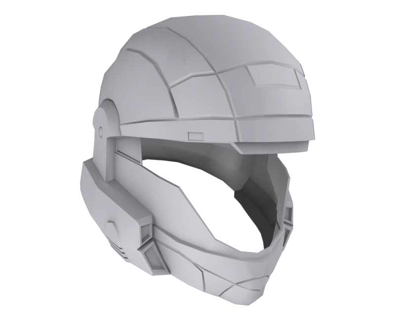
Working on another CNC project. Still gotta lot to do.
Shottie's up next, then I have to finish up the MC helmet for another guy. :downsdance:
September 28th, 2009, 05:19 AM
Advancebo
Re: The Studio Quick-Crit Thread
Nice.
September 28th, 2009, 05:46 AM
neuro
Re: The Studio Quick-Crit Thread
a small WIP i'm working on for a game a friend of mine is making.
(it involved robots)
this is just a blanc base for a robot, onto which modular attachments can be mounted.
(there's no tracks around the thing in this image, because i only build a small section of it, and then just tile that (works fine for a scrolling texture))
no need to bend that thing around the wheels when i only have to do that with the lowpoly
the plates mounted on the inside of the track bases are really only there to cover up the handle, since i'm baking those handles onto the flat side in the normalmap.
because i'm planning on mirorring the things, the handle would show on the inside too, which is what i didn't want, so i' simply added something there to cover it, so you don't see it (and don't notice the fact it's mirrored either)
September 28th, 2009, 03:35 PM
MetKiller Joe
Re: The Studio Quick-Crit Thread
I don't see anything technically wrong with it geometry-wise, but there is no context to the piece so it is somewhat hard to judge the model itself. Looks good, though.
from the wireframe, fingers look a bit too pointy and round, and listen to snaf and disaster, it looks like you just put some cylinders on the hand to me
September 28th, 2009, 09:18 PM
rossmum
Re: The Studio Quick-Crit Thread
It looks like a latex glove (or at least to me anyway, what with my lanky fingers)
since is a CNC project, make the visor glass or plastic that's see-threw. If you do use glass, make it tinted.
September 29th, 2009, 05:41 PM
NuggetWarmer
Re: The Studio Quick-Crit Thread
thanks for telling me what people have been doing for odst visors for a long time. it was helpful.
September 29th, 2009, 05:49 PM
Higuy
Re: The Studio Quick-Crit Thread
Quote:
Originally Posted by NuggetWarmer
thanks for telling me what people have been doing for odst visors for a long time. it was helpful.
:|
You did say if you should model the visor or not :raise:
September 29th, 2009, 05:52 PM
thehoodedsmack
Re: The Studio Quick-Crit Thread
I've seen two-way mirrored acrylic sheets that you can vaccuform into shape. Look into it. It could give you the reflective look the ODST helmets have.
September 29th, 2009, 06:09 PM
Ganon
Re: The Studio Quick-Crit Thread
Quote:
Originally Posted by NuggetWarmer
thanks for telling me what people have been doing for odst visors for a long time. it was helpful.
yeah anyday bro
September 29th, 2009, 07:44 PM
Hunter
Re: The Studio Quick-Crit Thread
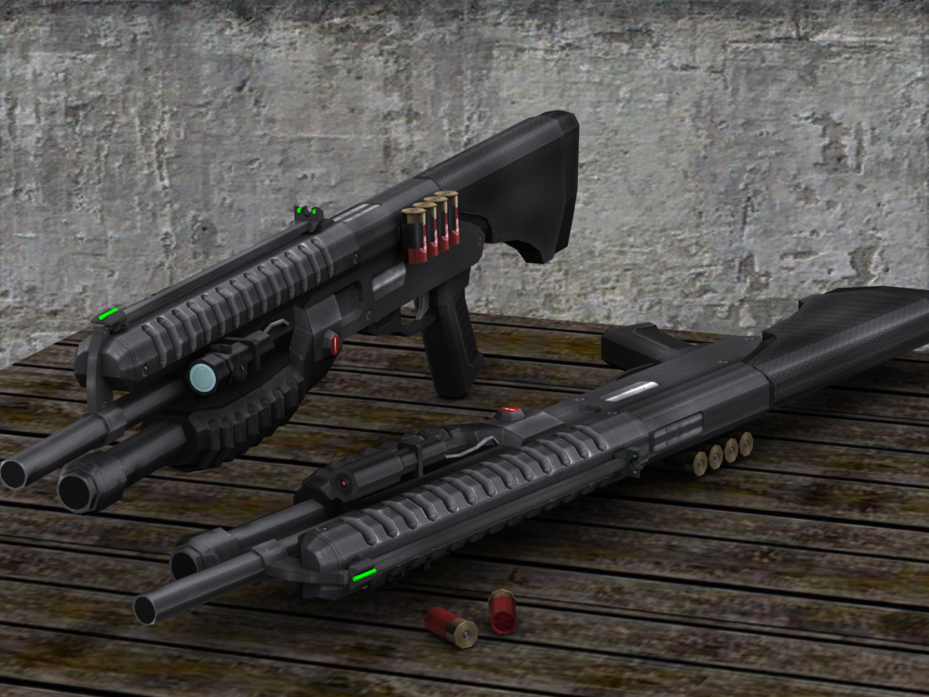
A member of a Crysis modding team I am in has textured my shotgun, it looks awesome.
I liked it better when the lights were blue, even if that was just for rendering purposes.
September 29th, 2009, 07:50 PM
Hunter
Re: The Studio Quick-Crit Thread
Same here, dunno why he made them green :S
September 29th, 2009, 08:03 PM
Disaster
Re: The Studio Quick-Crit Thread
That is nowhere near cryengine quality. If you are working on a Cryengine mod, you definitely need to ramp up the quality or its going to look like shit. At-least have a proper normal and specular map (from the looks of it, the high lights are textured on) made.
September 29th, 2009, 08:13 PM
Advancebo
Re: The Studio Quick-Crit Thread
It looks okay, I dont like the lights being green though (ew halo 2). also the metal on the barrel should be brighter than the grip parts. And why is the ejection port on the left side of the shotgun.