Re: The Studio Quick-Crit Thread
With logic.
Parts of a texture are going to use same materials, unless your skinning a Chimera or something.
In photoshop, just make layers for certain materials, don't completely section everything off into chunks of "barrel" "handle" "button" "bolt" etc, this makes it way harder to make things look seamless. Same goes for forerunner textures, or anything else for that matter. You can just do a base layer, overlay the bump map or shape layers onto it with a high pass filter on it, and then just build up layers on top of those using the selection tools and the paint brush tool to build up layers of detail and give them different blending modes.
Re: The Studio Quick-Crit Thread
Quote:
Originally Posted by
DaneO'Roo

Hunter if your trying to do forerunner, your failing.
Also, your doing it wrong, because you learnt from one of those fucking gun tutorials didn't you. The ones that tell you to skin every individual piece chunk by chunk, even though everything shares a common material layer.
This is why I hate 2d tutorials. They teach bad habits and other peoples mistakes, they don't teach the logical thinking involved with how you actually do something.
Sucks tbh. Ignore whatever you've learned, because it's not going to help you.
:( I will watch one of your tutorials.
Re: The Studio Quick-Crit Thread
Well, you can really do it either way. Whichever is better I think, but making it seamless when it's all seperated is much more time consuming.
Re: The Studio Quick-Crit Thread
Re: The Studio Quick-Crit Thread
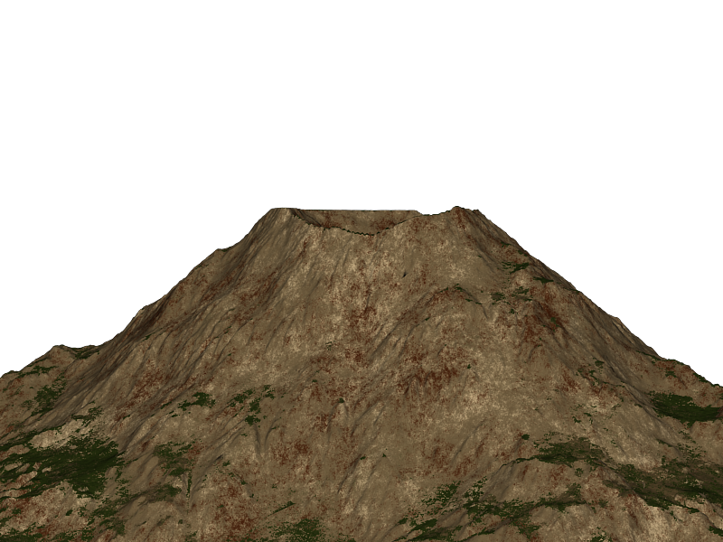
Looks like the asshole of a flood.
Needs more actual rock texture. Since when is a volcano a tan coloured zit looking crater?
Re: The Studio Quick-Crit Thread
I didnt photoshop that texture. I made it in groundwiz lite. I wish I could photoshop.
I'm going to change the tan to gray right now.
EDIT: 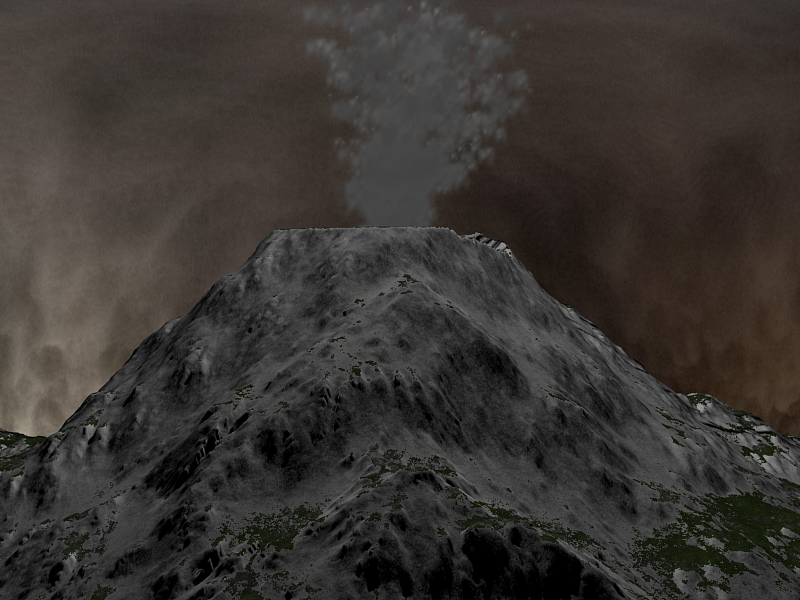
Need to get a normal map for the smoke material.
Re: The Studio Quick-Crit Thread
Thats what my orgasms look like.
But really, that looks more like a ginourmous cumshot than an erruption.
Re: The Studio Quick-Crit Thread
Quote:
Originally Posted by
disaster
I didnt photoshop that texture. I made it in groundwiz lite. I wish I could photoshop.
I'm going to change the tan to gray right now.
EDIT:
Need to get a normal map for the smoke material.
It looks better this colour, but... the crater, it's completely flat. :S That does not look realistic at all tbh. And to elaborate on what Dane is saying, to make this look as best as possible, your going to need to make it look real. Wether that be the actual model itself or the textures. With the textires, you should really try to have a rocky formation or obvious pointout on the bumpness of the mountain, the little and big parts that stick out that actually make it interesting.
For eg, look at this pic; (Pic is 1600 x 1200; actual volcano)
You can actually see that most of the rocky area is clearly noticable, and on the snowy top of the mountain you see more rock at the base of the bumps with the snow covering the top. Also, the eruption, as pointed out by sel, lacks detail completely, it all seems to be clustered together, nothing interesting about it either, I could make something better than that and I'm not experienced, but I've seen a lot of stuff in the years that I have the knowledge to critisize. Tbh, needs more chunks and random bits all over the place (eruption that is) and it looks to flat. :S Not sure as to how to say that, or what to do, someone here would know what I mean. But anyway, just throwing some ideas and advice out there, if anyone would want to explain better be my guest. :) Hope that made sense. :(
Re: The Studio Quick-Crit Thread
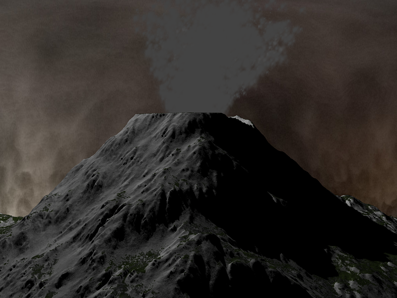
Worked on the particles a bit and variation in the volcano mesh.
Re: The Studio Quick-Crit Thread
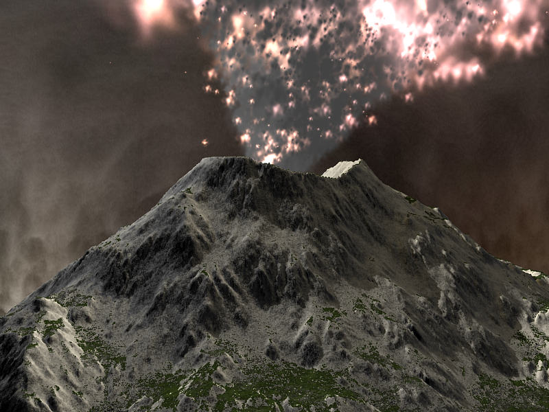
Looking much better, still not very believable though. The sky looks flat, as if you placed a plane behind the mountain. Last time I checked, they sky didn't look like that. Also, basic rules of composition state that there should be something interesting in the foreground, currently all you have is a middleground and background.
Shouldn't the mouth of the volcano be more scorched looking? Also, the explosion isn't casting any light on the scene.
On a less relevant note; there's no point putting an image that's less than 800x600 or is exactly 800x600px in [shot] tags.
A quick google search came up with this nice looking tutorial with a decent final outcome, for (i'm assuming you're using) Max.
http://www.3dsmaxresources.com/tutor...vironment.html
What it teaches you to do is not great, but it's decent enough for starting off.