hrrrg.... oh ok ross said it already.
saved your ass! Hope to see it improve.


hrrrg.... oh ok ross said it already.
saved your ass! Hope to see it improve.

I'm lost for suggestions. Any help?
Joshflighter: hmm
Joshflighter: go see what modacity says
Joshflighter: lmao
Joshflighter: I dont really know
Joshflighter:

Last edited by Newbkilla; March 16th, 2009 at 08:35 PM.
if i find the time i'll go ahead and post a demo for you.
Thank you. The only tutorial I've ever watched was the Beretta 9000. Besides from that, I've just looked at forerunner and tried to make variations of it.
That would be great Snaf, I've always had trouble with the whole tapering thing, like figuring out the angles and such. I'll look into it though.
Newkilla, thanks for posting that picture. I've actually been trying to model that structure for a while now, but I didnt have a good ref. The image is a super blurry pic that someone sent to me, so this helps. Add me on xfire please: corndogman939.
Just let me know if you need any more.
Looks good, you have the right idea for forerunner stuff, just try to keep it making structual sense and it should be fine.
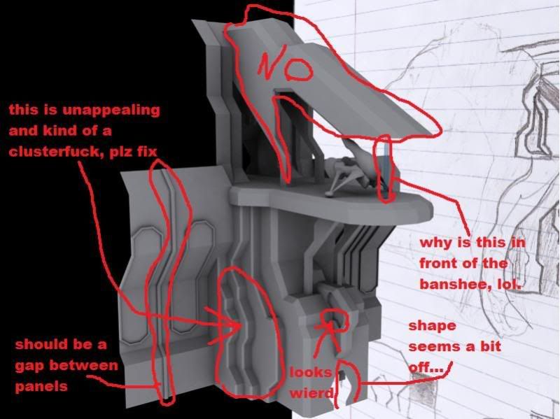
The extrusions/gradations on the the side are gratuitous and ugly, you should use panels, lights, or any form of actual item that could theoretically serve a purpose to add detail to your wall. Please use more curves too, circles and some ninety-degree bends can really break up some of your angular monotony. That piece on the top simply does not look right, you're going to have to axe that. It's phenomenally trite for forerunner buildings to be capped with that shape. The wall is very similar to something I once did but it needs more detail or bolder shapes, perhaps some sort of device every three panels or something. The cut out shape that you have in your indentation looks funky, too.Originally Posted by Newbkilla

Here is what I feel looks wrong right now:
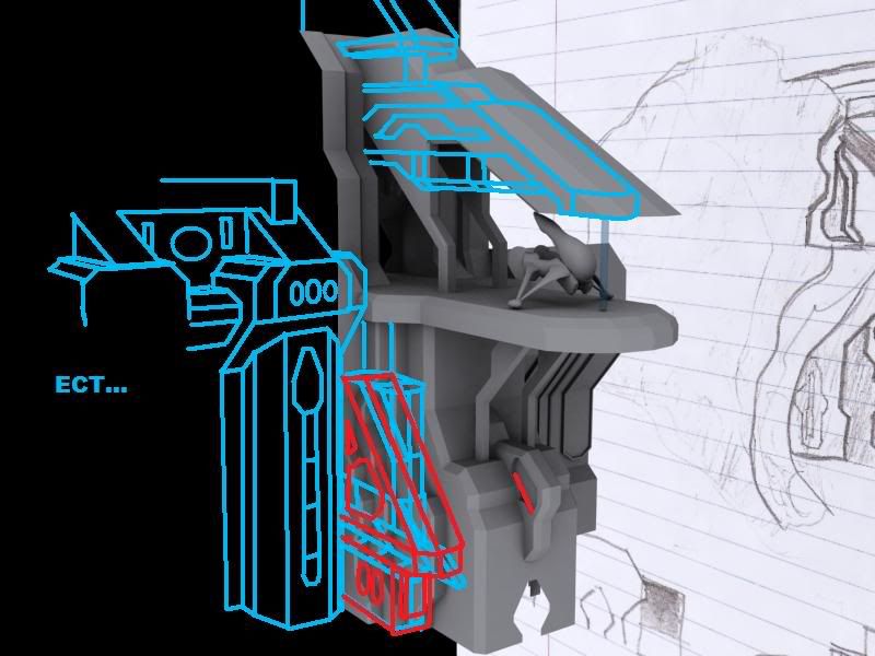
Here are some ideas for improvements:
It's not about having detail, it's about using detail.
Nice drawings :O
Definitely will look better.
Reminds me of Avalanche, especially with Mass's additions.
There are currently 1 users browsing this thread. (0 members and 1 guests)
 Posting Permissions


Bookmarks