Now the water is too rough and edgy. Looked better before.


Now the water is too rough and edgy. Looked better before.
Hate to say it but its actually getting worse, you added more purple/pink to it which is good, but now i feel like there's not enough orange/red. Try to balance it. Water looks unrealistic now.
Get Dreamscape if you can, its what i made this with:
http://i199.photobucket.com/albums/a...ousesunset.jpg
You can do basically the exact same thing your doing, but a lot easier with it, except i didnt really bother to make a really fancy render with mine.
That reminds me of TF2, with the soft reflections in the water...Originally Posted by corndogman939

But yeah, disaster, now the water looks a bit like metal/scratched chrome, I think you should have kept it the way you had it before (textured plane). But maybe you could make the bump a bit softer/blurred, so it isn't so sharp.
I know, im still bad at textures....
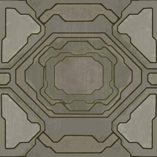
Good design with the black lines, but why do you have like a green glow around them? Scratches are too dark and there is really no definition of what the texture is supposed to be... Metal, wood or what?
Try to improve on your skills at maybe defining what it is supposed to be, otherwise the basic drawing is a good design just the colors and texture (What it is) need lots of work.
I can never get that green forerunner look.
Im better at the grey metal stuff... thanx for the crit though
If you can make metal just overlay a green layer or make a new layer over the metal filtered part, then just fill the layer (Or parts of it) to the intensity of green you want and change the opacity.
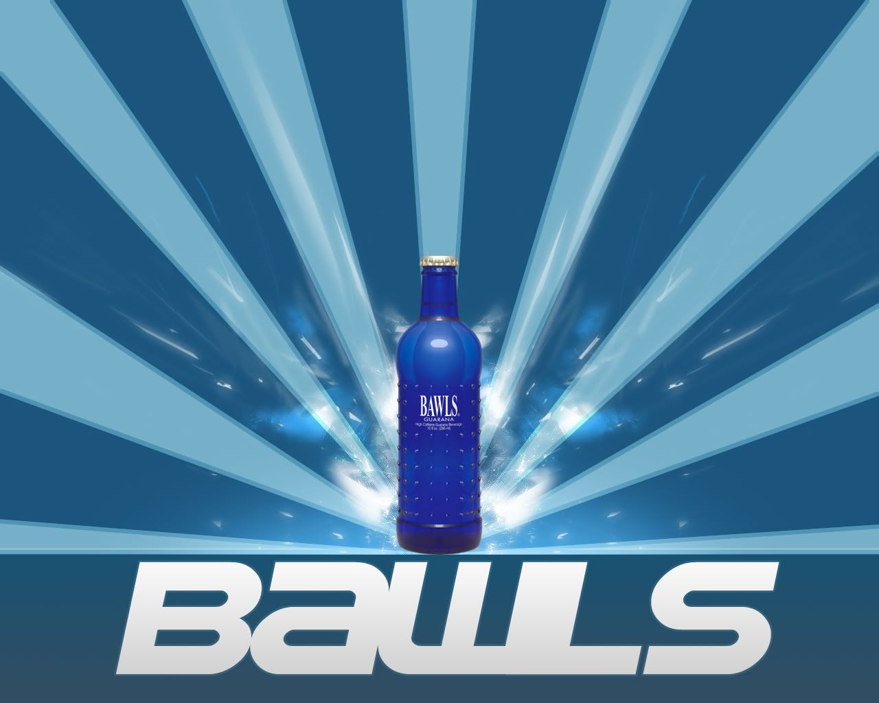
Pretty realistic render, although the glass isn't really shown and it looks sort of plastic. Given away by the pop off bottlecap. Nice design, is it an actual drink or is that just for luls?
E: This is in response to killers texture, i took forever to type it though.
Needs more... depth and variation. For example parts that seem like they're elevated need to look more like they are higher up, and with a different colored metal. Its mostly all very similar colors which makes it very bland, add some variation.
Also the scratches, they look unnatural and like you just randomly dodged around with no real thought to it. For instance you have scratches going straight across areas where its supposed to be at different heights, when realistically it would not scratch like that.
The design looks pretty good but seems a little screwy in some areas. like its meant to be mirrored but its different in some areas. its mainly the middle polygons things, they are not centered within each other, and one side is not the same as the opposite side.
I'd say go back to the original part (before you added the scratches and colors, just the lines) and mirror the top right quadrant across to all four quadrants. then it should be all symetrical then you can proceed to paint the color.
/rant, hopefully that helped.
There are currently 6 users browsing this thread. (0 members and 6 guests)
 Posting Permissions

Bookmarks