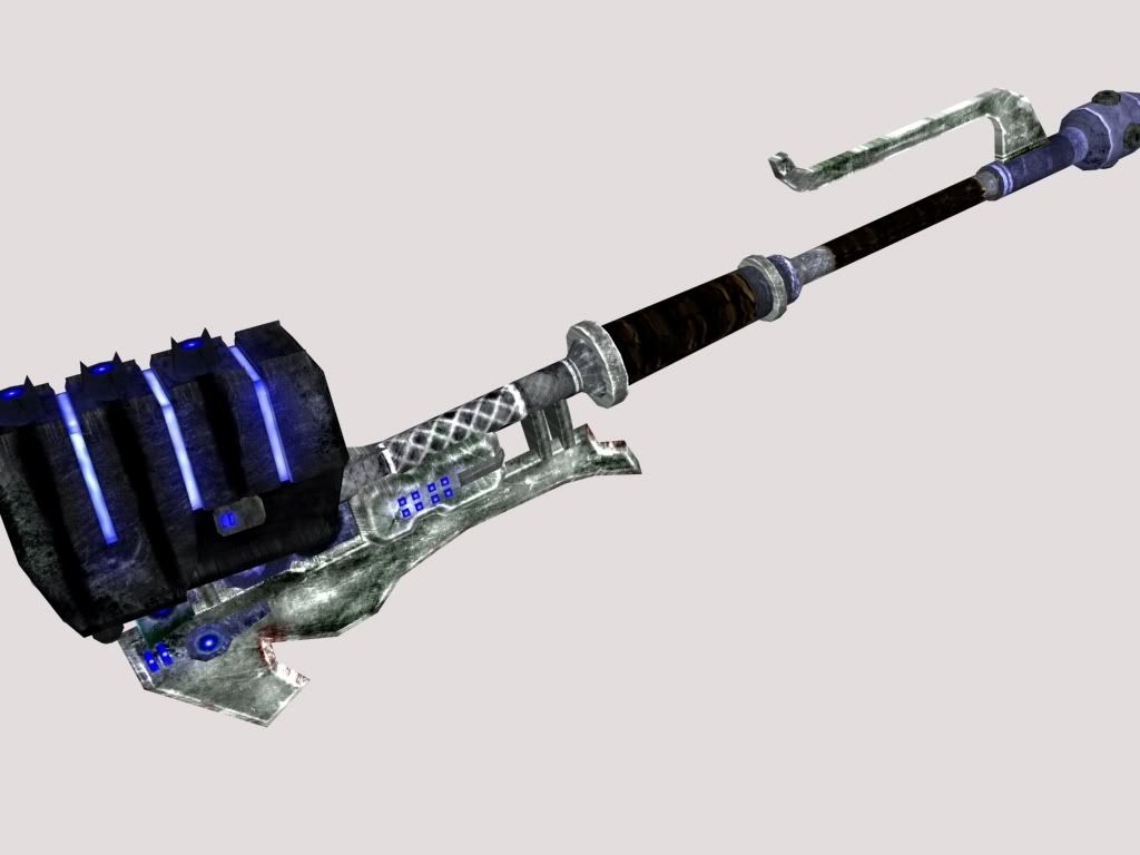
Im going to take the plunge and ask for criticism on my gravity hammer skin.

I purposely made inaccuracies to halo 3 (in the skin, the ones in the model aren't intentional but IDGF) because I wanted to use my own sort of design. Its very grimy and scratched up because thats cruise control. Crit please, but be gentle I've never really made a weapon skin before.
Uvw and skin by me, model by Donut (who isn't looking for criticism on the model)
The resolution is 1024.
The metal seems kind of contrasty in some areas
it is partly the low quality render, but I think your talking about crosshatched area above the grip?
Not what I meant, but those white lines on that seem out of place. What I was talking about was how on the blade at the back there are areas where it's almost completely black or dark. Some areas seem brightened and overdone. Looks like you've used with the burn and dodge tool a little too much.
oh those areas on the blade are actually dark green. meant to be slime or something. I made that with the thought of brutes chopping through trees in mind
lumberjack brutes? lol
edit: brb while I PS a lumberjack brute.
Last edited by Con; August 12th, 2008 at 09:14 PM.
Looks TOO grungie. Looks good as far as the personal changes go, but you might wanna make it look cleaner. It was a good creative direction to go, but it seems too splotchy.
Lumberjack brute ftw...bit unnacurate one might say though... unless you're planning for splinters
I like it grungy. I really don't want to make it clean, because clean = boring.
There are currently 4 users browsing this thread. (0 members and 4 guests)
Bookmarks