The one thing I noticed was the thumb right at the last moment. Otherwise I didn't spot anything else, nice job!
The one thing I noticed was the thumb right at the last moment. Otherwise I didn't spot anything else, nice job!
The frame gun movements look terrible to be honest, and the hand gets to far to the right at times. it also pauses for a frame or two, and that looks kind of wrong to me. When it returns to the origin, the hand seems to catch it a little late as well, and that looks pretty unnatural. It also doesn't look so much like hes throwing it. What I would suggest you do for frame gun is add more rotations on the X axis so it doesn't look so much like he's stiffly moving it upward and then immediately bringing it back down. The model looks awesome though. Where did you get it, or did you make it yourself?
Thanks for the crit, I'll try to work some stuff in. A few things to address: 1) The thumb has no problem, that's just some weird ass shadow because of the lighting. I noticed it too but when I went back to look at it, nothing was really wrong with it. 2) The base model is mine, but then WOL did some awesome stuff to it for hrh (stock, stuff for the sight, the rails).
I love the model. I'd like to play with it myself sometime.
Hmm, the model blows I know, this was more to do with the texturing. I plan to add more dirt and rust onto it. Maybe some scorch marks and general grime. The red things on top are suppose to be lights, I havent got round to texturing them so its a generic red for now
And to show off my crappy modeling skills in true 3d, a video
I dont have max on this pc and file so I cant get any more renders till after xmas, this pc has nothingpart from coding :P
Edit:
What do you think of my 5 min master chief and grunt that doesnt really look like a grunt asset work? Two of many Halo ones I need to make for my game =\


Last edited by Limited; December 18th, 2008 at 11:50 PM. Reason: Grunty! :)
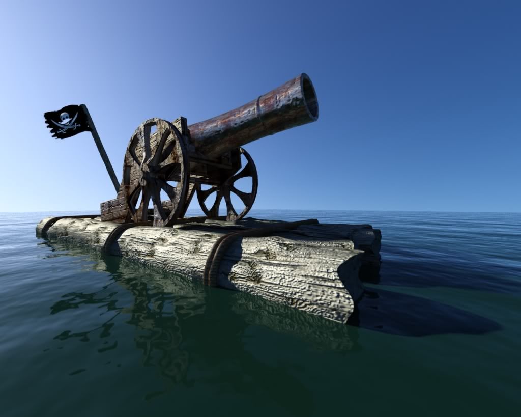
Posted this over in the monthly challenge...about 1.5 hours of work (not rendering time)
Last edited by kenney001; December 18th, 2008 at 11:40 PM.
Looks nice, but the texture at the front of the raft seem blurred.
my female BFF drew this for me for my 17th Birthday as a card. it's only a section of the front page. I scanned the image and then added a blue-to-green cyan gradient and tried to fix the lighting and added a lense flare.
Last edited by Amit; December 18th, 2008 at 11:54 PM.
There are currently 3 users browsing this thread. (0 members and 3 guests)
Bookmarks