Looks good for its intended purpose.


Looks good for its intended purpose.
Not finished
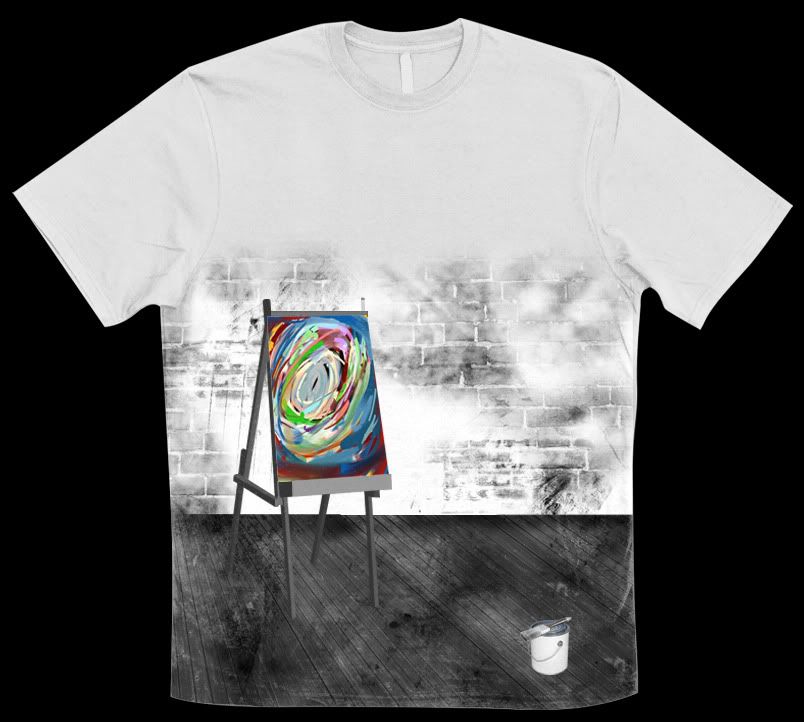
"Opportunity Awaits"
too full? does it just end on the sides there?
Also... there's no shadows on anything... it makes it look weird
I suppose it could be a wrap around design... Yeah, no shadows yet, I just wanted to see what it would look like on a tee. Thanks for the comment
I suck with drawing perspectives to be honest. But the wood, the wall, the canvas, and the paint bucket, just don't seem to flow well with me. Something just looks.... off, but I can't really tell what it is.
Is this an actual shirt or in photoshop?
I'm with Llama on this, you need a bit of shadow in there and your wood tiles seems to not be perpendicular to the wall or parallel either. I don't know why but what you said about the bucket and canvas pops out...
i'd also break up that brick wall... in some way.
I don't like how it's one big square image.
I'd toy with breaking off part of the wall or something like that so that the top of the image isn't just flat all the way across... it just looks weird. IMO
That's one of my favorite shirts I have, and... they used their negative space just as well as their positive space.
I don't want to say to scrap your idea, but I think you might be able to get it across better in a more interesting environment. Think if the aisle was setup at a park You could have the trees and such behind it without the need to actually paint a full scene. Also... get rid of the paint bucket, give em a pallet 'cause... you have a bunch of colors there... and one bucket of paint... it doesn't make sense lol.
full- http://img233.imageshack.us/img233/8336/wip.jpg
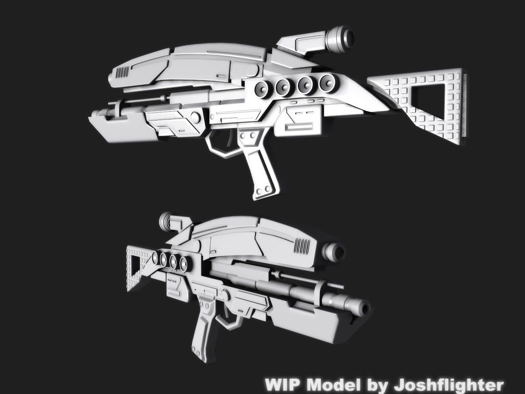
Hunter's pistol, my first texture. currently working on the handle, don't even look at anything else.
DEEfag showed me how to do it
Last edited by Futzy; July 12th, 2009 at 07:08 PM.
But the paint bucket has a little galaxy in it!!!Originally Posted by Llama Juice

(you probably have to see it at higher res)
I like your idea about the park.
Thanks for the comments thus far.
Disasters help + me not being lazy = me modeling this:
Thanks Disaster.
There are currently 5 users browsing this thread. (0 members and 5 guests)
 Posting Permissions


Bookmarks