The old thread needs a break. The same rules apply here as in the old one, so make sure to read them over again.
Here's to another year of creativity


The old thread needs a break. The same rules apply here as in the old one, so make sure to read them over again.
Here's to another year of creativity
Can I get some crit on this post please
Top quality A++ post Timo. Finest I have seen in ages.
Thanks, it was a speed post -- only 10-20 seconds. Good to see I didn't lose any points for quality.
Your post needs better spelling and grammar.Originally Posted by Timo


Daniel Jackson from Stargate Sg1/Atlantis. I used my own palate colors and its a half paint over for main shapes and the rest isnt. =)
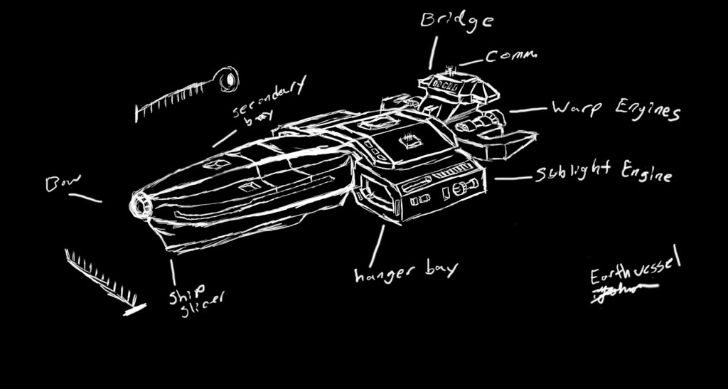
Was doing a concept of a starship, but I wanted something epic in it, to make it different from other scifi ships. Eh, I dont seem to be able to think of something epic that would go with it.
Stargate is awesome
Should be, "Might I get some critiques on this post, please?"
It's instantly recognizable as Jackson, so great job. I think you need to work the mouth a bit more because he has a bit of a blue steel expression.
Try committing to lines instead of making short scratchy strokes. A smaller brush would help, as would some perspective lines draw out beforehand. Don't forget you can click, then use shift+click to create a straight line. As for the design of the ship, I don't find it attractive nor practical. For example, tiny sub-light engines stuck to the side of the hangars is just strange.
When I use my tablet with Shift+click, it fades away to the second point. Any idea why?
There are currently 3 users browsing this thread. (0 members and 3 guests)
 Posting Permissions


Bookmarks