Dur, this is easy. You just didn't put a UNSC emblem on it.Originally Posted by killer9856


Dur, this is easy. You just didn't put a UNSC emblem on it.
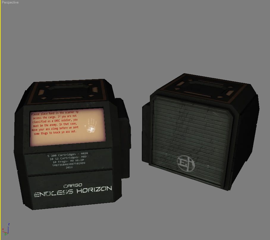
e/f;b
The way your post came across to me was more "I MADE THIS OFF OF GOOD REFS I CHALLENGE YOU TO PROVE ME WRONG" rather than "Oh, what's wrong?".
It's not FOV distortion, trust me. I thought something looked off and it took all of two seconds looking at the world.guns.ru photos for me to twig on what it was. The rail spacing is wrong, the mags are definitely airsoft mags, the pistol grip is of the wrong cross-section, the ejection port is too high and slightly misshapen considering the detail in other areas... I realise refs of the real thing are a pig to find, but they're out there if you know where to look. I'd imagine you're probably not as into rifles as me, but it shouldn't take long to work out what's an airsoft mag and what's not; a real mag wouldn't have that 'step' at the rear, and would have some form of lip curling inwards at the top to prevent the rounds from just popping out of their own accord.
In UT3 to take a screenshot without your gun instead of using the "ShowHUD" console command use "ToggleScreenShotMode" That way you'll hide the gun and the HUD.
@kid908
It needs to be more shiny and have more lights, which UT is good at.
I'm working on the material right now, but....
Stargates from the milkyway are rarely shiny. They have typical dry stone like material. even the lights aren't as shiny as I made them to be. After all, the stargate is OVER a MILLION-year old.

So it's been what, 2 years you've been working on that model?
Working on this again, now that I got hosting again thanks to codebrain

nice, i like the layout and ui.
There is an extreme overuse of 'glow' and drop-shadow on things that really don't need it. Plus the shadows seem too intense and at nasty angles for the thumbnails. I do not like the border around the thumbnails, it should have an even pixel border rather it just looks a bit stretched and awkward. I don't get the Adobe Illustrator and Adobe Photoshop icons in the bottom middle. Why are they there? I hope they're not actually supposed to be there. The italicized font for your name and the title under it doesn't match the rest of the websites flow of design. There is a lot of blank space in the dead center and it, as well as the Icons mentioned before, look a bit off. If you scrapped the icons in the middle and made the brightness darker it would look more interesting as a center piece. Just noticed all the gradients, you might wanna ease up on that a bit.
You really gotta think of how you are using your space. It can end up being a problem or looking bad. You could just add 2 sections under Digital art, one for Wacom Paintings and the other for the rest. Think about integrating the giant icon above 'Home' into the banner and create a small image to go along with it, and within that image throw in your name and title to spruce it up. I would imagine 'Contact' would either have a tab of it's own or most likely under about.
It's alright, I'm not a fan of it but gave my critique.
Last edited by Bastinka; January 28th, 2010 at 06:23 PM.
I think you need something more bandwidth friendly. All of it is made up of images, and large non-repeating images at that.
There are currently 1 users browsing this thread. (0 members and 1 guests)
 Posting Permissions


Bookmarks