Much better IMO. However, make the particles that shoot out (hope you know what I mean) more spread out. It looks goofy with those things only concentrated near the top.Originally Posted by =sw=warlord


Much better IMO. However, make the particles that shoot out (hope you know what I mean) more spread out. It looks goofy with those things only concentrated near the top.
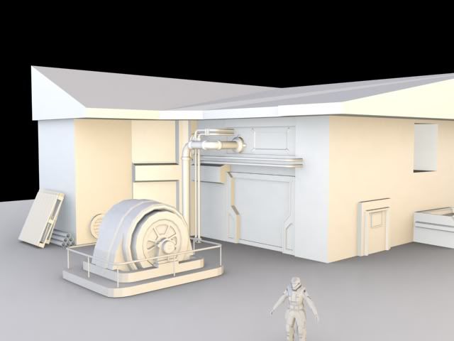
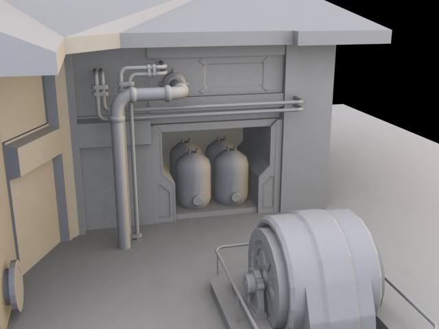
Haven't posted in a while... was making a small scene, trying to learn from it.
Learned some more proper ways of making textures. Ignore the green part for now.
Comments are needed. Tell me what else I could add or fix or do. Thanks.
That's nice and all, but GOW was a 3p shooter. Your model has a somewhat interesting 3p silhouette, but truth be told yet again, your fp is just a box. If you're going to spend your time creating a high-poly model and you're considering it for fp rendering or in-game, just use a concept like that as a guideline, and do what you can to make it not-so-boring. You should always consider the silhouette from perspective, the side and from the top. Even the shape from the front should be something identifiable.
Well, this is an HUD design I'm working on, that's essentially a fusion of Halo 3's layout and Halo 1's design. The reason for the Mk. VI-style outline is that the visor this HUD is being made for is very similar in design, with only a few noticeable variations that I've tried to include in this HUD (which I wish wasn't the case, because I'd love to have a less Halo 3-style outline, but I've got to stick with the model...) And I know there's not a huge amount to crit right now, but I might as well get any recommendations now before I get too far. The plan for now is to try being faithful to Halo 1's ammo and grenade layout, which will definitely get rid of some of the Halo 3 look, but I'm not quite sure how it'll play out with everything else in the HUD.
And yes, health is a slider instead of individual bars, but that's part of the game's design.

Health bar should be in the middle. Easy to see without actually looking at it.
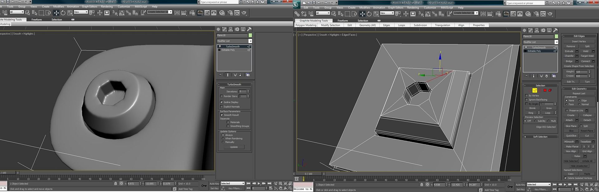
@hunter first of all the inside of the screw is too straight on, needs to be at more of an angle. Also, add more sides, don't just do a square, it helps to have at least some sides in there, I usually use a 6 or 8 sides for round objects, depending on size. Iterations won't solve everything for you.
also, your edges should look more like this, supporting edges are important.
That's probably not perfect either, but the two edges surrounding the outside and inner circle are
Last edited by PenGuin1362; June 17th, 2010 at 10:00 PM.
make quads, and loosen your edges.
Boxes don't subdivide into perfect 360 degree circles. You need at least a pentagonal shape to get something decent. Octagonal is best here because the hole is an octagon.
Be careful where you terminate your support edge loops. You might wind up with something like this:
Just keep in mind where subdivision is trying to push the vertices. When edges get pushed over other edges, it's not a good thing. In general, I don't think it's good to have any triangles in areas where smoothing is taking place. Keep the triangles in the planar areas of your mesh.
Need some help with a seam issue.
For one reason or another, there's a horrible black seam in certain parts of the mesh but not others, the UV's have not been tampered with between the bitmap and model so I'm not too sure what's going on.
Any help would be greatly appreciated.

You need to texture out a little wider than you are. Select and grow the selection by 2 pixels or so, and it should be fine.
There are currently 1 users browsing this thread. (0 members and 1 guests)
 Posting Permissions


Bookmarks